


Finding the perfect wall colour combination is difficult, as well as crucial, if you are looking to revamp your house with limited resources. Therefore, proper planning and its execution is necessary to select a wall paint colour combination. One should keep all angles in mind while deciding the interior paint colours. With this article, we like to share a few ideas that will help you pick the best home interior colour combination for Indian homes.
House interior painting colour combinations
There are various interior colour combinations that you can use to enhance the overall appearance of your house. While the combination you choose depends on your personal choice and the overall interior decor of your home, the below house interior painting colour combinations have proven to work well for most homes.
Wall colour combination #1
Yellow and white
If you want to experiment, try this white and yellow wall colour combination to your house. This is one of the most trending interior colour combinations for Indian homes.


Also read: Tips to choose the best two colour combination for bedroom walls
Interior colour combinations for Indian homes #2
Peach with white highlights
The calm and cool peach colour is not something that overwhelms you. You don’t need to have white walls to complement the colour scheme. Use them as highlights. This will be an ideal house interior painting colour combination for any Indian home.

See also: Painting cost per square foot and useful home painting tips
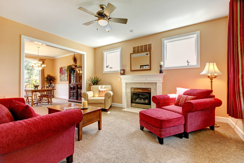
Home interior colour combination #3
Red and white
The red and white interior house painting colour combination is often used for living rooms in India. While red colour oozes out drama and warmth, white complements its dark tone, giving a light breather.

See also: A guide to choosing home colour for each room
Interior colour combination #4
Purple and white
With white background, a light shade of purple, which is neither like lavender nor like eggplant shade, would do wonder for your living room. This wall paint combination colour is apt for any modern home.

House interior painting colour combination #5
Orange and brown


Wall colour combination #6
White and green
The white background will accentuate the beauty of green colour. This wall colour combination is neither dull nor boring. This home interior colour combination would look unique and outstanding.

Interior wall colour combinations #7
Blue and white
Blue is the easiest and subtle colour to be introduced in your home. Its shades have different effects on home interior, depending on the way they have been used. The blue and white wall interior colour combination would look pleasing to eyes.

House interior painting colour combinations for walls#8
Pink and purple
Pink and purple are shades of the same colour family. They are widely used to deck up houses. The result is often marvellous. This could be your go-to interior colour combination for Indian homes, especially in areas that remain hot throughout the year.

See also: Your guide to choosing the best colour combination for house exterior
Wall colour combination #9
Purple and white
Purple walls surrounded by white colour can prove to be a great interior house painting colour combination. This wall colour combination can be the perfect setting for warm and comfortable living rooms with plenty of light.

Home interior colour #10
Orange and white
Like a perfect home interior colour, orange is often used in Indian homes. Orange and white colour combination brings out dramatic vibes in your living rooms. While orange reflects energy, white does a balancing act. They look beautiful and soothing together.


Wall colour combination #11
Pink parade
This colour combination attracts your attention as it is soothing to eyes and looks elegant. You can certainly go for this wall colour combination to give a cool and charming effect to your home.

See also: All about Vastu colours for home
Home painting colour combination #12
White and yellow
Adding a little bit of sunshine to your home painting colour combination is not difficult. The white and yellow wall colour combination is apt for your living room, if you are looking for vibrancy.

Interior colour combination #13
White and green
Having an entire room painted green might not be a good idea but mixing and matching different shades of green with white would do wonders to your home interior. Check out this perfect white and green interior colour combination for more ideas.


Interior colour combination
Brown and white
Brown and white wall colour combination is safe. It is traditionally used to give a formal, slightly elegant look to houses. In modern houses, where space is limited, dark colours might not look good. This could be the go-to interior colour combination for Indian houses that are traditionally constructed.

Interior colour combinations for walls #14
Pretty peach
Peach colour has toppled the traditional favourites from the top positions. Pleasant, light, and bearable, peach coloured walls with a white ceiling is one of the best interior colour combinations for Indian homes.


Wall colour combination #15
Blue and white
This wall colour combination can never fail to impress. Blue is an apt choice for any interior colour combination due to number of shades available in the market. The powder blue shade combined with matte white hue gives elegance and classy appearance to the room.

Colour combination for kid’s room
Go for a splash of colours the sun painted on one wall of the bedroom. This one is quite cool for a kid’s room.
Colour combination number 16


Colour combination number 17

Colour combination number 18
Absolutely sophisticated and subtle, this colour combination speaks volumes of luxury and style.


Colour combination number 19
The raw mixing and matching of colours would create a very dramatic, different vibe! Make it more exciting with this sort of combination.

Colour combination number 20
For a more formal setup with a lot of warmth, dark shades of blue and grey could work well, too.


Green on green #21


Grey and blue #22


White on white #23

Grey and white #24


Green and powder pink #25


Pink and white #26


Grey and brown #27


Pastel pink and cream# 28


Green and brown #29


Cheery red and pink #30

Black and white #31


Peach and cream#32

Shades of green #33


Shades of pink #34

Home interior colour #35


Home interior colour #36


House interior painting colour combinations #37


Home interior colour#38

Home interior colour #39


Home interior colour #40

Beige and white wall colour combination #41

Shades of Blue wall colour #42


Rust and white wall colour combination #43


House interior painting colour combinations #44


Teal and beige #45
A mix of cool and warm tones that creates a balanced, sophisticated look.


Source: Pinterest
Mustard yellow and charcoal grey #46
Bold and dramatic, yet warm and inviting for a contemporary space.

Source: Pinterest
Lavender and soft grey #47
A calming combination, great for bedrooms or reading nooks.

Source: Pinterest
Mint green and white #48
Fresh and airy, giving a clean, serene vibe.

Source: pinterest
Burnt orange and cream #49
A warm, earthy combo that brings comfort and cosiness.

Source: Pinterest
Navy blue and gold accents #50
Luxurious and rich, perfect for formal living spaces.

Source: Pinterest
Coral and light grey #51
A fun and modern combination, great for living rooms or kitchens.

Source: Pinterest
Turquoise and sandy beige #52
Inspired by nature, this gives a beachy, relaxed feel.

Source: Pinterest
Emerald green and ivory #53
Regal and elegant, it works well in both classic and modern interiors.

Source: Pinterest
Olive green and terracotta #54
Earthy tones that bring warmth and grounding to any room.

Source: Pinterest
Blush pink and charcoal #55
A chic, sophisticated look with a modern edge.

Source: Pinterest
Pale yellow and grey #56
A subtle, welcoming combination that brings warmth without overwhelming the senses.

Source: Pinterest
Forest green and taupe #57
A deep and natural palette, perfect for tranquil spaces.

Source: Pinterest
Clay red and soft beige #58
Warm and rustic, ideal for cozy living spaces or dining rooms.

Source: Pinterest CovermyCushion
Steel blue and warm white #59
A crisp, modern combination that works well in any room.

Source: Pinterest HomeIdeolo
Dusty rose and cream #60
Soft and subtle, great for creating a romantic and calming environment.

Source: Pinterest interiorthemes
Goldenrod and slate blue #61
A unique and striking contrast that adds depth and style.

Source: Pinterest eleganthomesx
Powder blue and charcoal black #62
A soft, yet bold mix of light and dark that gives a room a balanced, timeless feel.

Source: Pinterest mcguirekitchenbath
Blue and White: A cool contrast for modern spaces
This room uses a bold blue accent wall against crisp white surroundings to create a fresh, youthful vibe. The contrast adds depth without overwhelming the space, while the dark grey furniture and light wood flooring balance the cool tones. Ideal for bedrooms or study areas, this combo feels modern, focused, and energizing—perfect for both relaxation and productivity.


Beige and Burnt Orange: A Cozy Earth-Toned Blend
This living room pairs soft beige walls and upholstery with rich burnt orange accents for a grounded yet inviting look. The warm feature wall and matching cushions add depth and contrast, while natural light and neutral decor create a serene, well-balanced space. Ideal for Indian homes seeking an earthy, elegant vibe with timeless appeal.


Terracotta and taupe: A bold yet balanced blend
This living space pairs earthy terracotta tones with soft taupe and greige shades, striking a beautiful balance between warmth and neutrality. The burnt orange furniture adds vibrancy and depth, while the muted walls and flooring create a calming backdrop. Perfect for modern Indian homes, this palette offers a luxurious and welcoming feel without overwhelming the senses.

Muted greige and white: A minimalist harmony
This hallway features a refined combination of greige (grey + beige) walls with white trim, creating a clean and sophisticated look. The soft neutral tones offer a sense of spaciousness while complementing the natural wooden flooring. Ideal for modern Indian homes, this palette enhances light, balances warmth and coolness, and pairs effortlessly with a variety of furniture and decor styles.


Soft Green and White: A Refreshing Bedroom Palette
The green accent wall adds warmth without overpowering the room, while the white furniture and bedding keep the space airy and bright. Subtle pops of color in the cushions and wall art enhance the visual interest, making it a perfect balance of elegance and comfort.


Best colour combinations for each room in your home
- Living Room: Beige + burnt orange, white + navy
- Bedroom: Lavender + grey, dusty rose + cream
- Kids’ Room: Yellow + blue, pink + mint green
- Kitchen: Coral + grey, turquoise + beige
- Study/Work area: Blue + white, olive + charcoal
- Pooja Room: Yellow + white, soft orange + cream
Which paint finishes suit which colour combinations?
Choosing the right wall colour is only half the story. The finish or texture of your paint dramatically impacts how the colour appears under light, how easily it can be maintained, and how it blends with the rest of your interiors. Here’s how to match paint finishes and textures with different colour combinations for best results in Indian homes:
Matte Finish – Best for soft, soothing shades
- Ideal for: Peach + cream, dusty rose + white, lavender + grey
- Why: Matte absorbs light and hides wall imperfections, giving a smooth, elegant look perfect for bedrooms and low-traffic areas.
Satin or Eggshell Finish – Perfect for contemporary spaces
- Ideal for: Teal + beige, powder blue + charcoal, mint + white
- Why: Satin reflects a bit of light, adding depth without shine. It’s great for living rooms, hallways, and dining areas that need both style and durability.
Glossy / Semi-Gloss Finish – For bold accent walls or small spaces
- Ideal for: Navy + gold, black + white, mustard + charcoal grey
- Why: Glossy finishes reflect more light, making rooms feel brighter and larger. Best used selectively—like on an accent wall or a niche—since they can expose flaws on uneven surfaces.
Textured Paint / Limewash / Stucco – For rustic and earthy vibes
- Ideal for: Terracotta + taupe, olive + cream, clay red + soft beige
- Why: These textures create a warm, grounded aesthetic and pair beautifully with ethnic, Bohemian, or traditional Indian décor. Perfect for living rooms, pooja rooms, or reading corners.
Tip: If your home has less natural light, avoid high-gloss finishes unless you’re using them to reflect artificial lighting creatively. For smaller homes, go for satin or velvet matte—they offer balance without overpowering.
How certain colour combinations align with Vastu or Feng Shui?
Vastu shastra color guidelines
Vastu Shastra associates specific colors with different directions and rooms to promote well-being:
- North-east (Ishan): Ideal colors are light blue and white, promoting tranquility and clarity.
- South-east (Agneya): Associated with the fire element; suitable colors include orange, pink, and silver, enhancing energy and creativity.
- South-west (Nairutya): Earthy tones like brown and beige are recommended, providing stability and support.
- North-west (Vayavya): White and light gray are favorable, fostering movement and change.
Feng shui color guidelines
Feng Shui emphasizes balancing the five elements (Wood, Fire, Earth, Metal, Water) through color:
- Wood element (East and southeast): Green and brown hues support growth and vitality.
- Fire element (South): Red, strong yellow, and orange stimulate passion and energy.
- Earth element (Southwest and northeast): Light yellow and beige promote stability and nourishment.
- Metal element (West and northwest): White and gray encourage clarity and precision.
- Water element (North): Blue and black support calmness and communication.
Integrating vastu and feng shui with interior color combinations
To align your interior color choices with Vastu and Feng Shui:
- Identify room directions: Determine the cardinal direction each room faces using a compass.
- Select harmonious colors: Choose colors that correspond to the Vastu or Feng Shui recommendations for each direction. For example, a living room in the North-East could benefit from light blue or white shades to enhance tranquility.
- Balance elements: Ensure a harmonious blend of colors representing different elements to maintain balance. Avoid overusing a single color or element, which can disrupt energy flow.
Housing.com POV
Choosing the right wall colour combination can dramatically transform your living space, setting the mood and enhancing the overall design. From bold, contrasting hues to soft, neutral palettes, the endless possibilities allow homeowners to express their style and elevate their interiors. The key is to blend creativity with practicality, ensuring that your choices reflect your taste and the ambience you want to create.
FAQs
How do I choose the right colour combination for my room?
Consider the room’s size, natural light, and the mood you want to create. Lighter shades make spaces more prominent, while darker tones add warmth and intimacy.
What are popular colour combinations for living rooms?
Neutral tones like beige and white paired with accent colours like teal, mustard, or grey are popular for creating a cosy yet modern living space.
Can I mix bold colours for a smaller room?
Yes, but balance is critical. Pair bold colours with lighter neutrals to avoid overwhelming the space while adding vibrant accents.
Which wall should be the accent wall in a room?
The accent wall is typically the one you first see when entering the room, often the wall behind a focal point like a bed or a fireplace.
How do colour combinations affect the mood of a room?
Warm colours like red and orange evoke energy, while cool tones like blue and green bring calmness. Neutrals provide balance and versatility in setting the room’s tone.
| Got any questions or point of view on our article? We would love to hear from you. Write to our Editor-in-Chief Jhumur Ghosh at jhumur.ghosh1@housing.com |