


Pastel colors are a popular choice in design and fashion. They are soft, muted colors created by adding white to primary or secondary colors. Pastel colors are often associated with spring and summer, but they can be used year-round to create a calming and soothing effect. Here, we will explore the history and psychology of pastel colors and how to use them in design.
History of pastel colours
Pastel colors have been used in art for centuries. The term “pastel” comes from the French word “pastiche,” which means paste. Pastels were first used in the 15th century by Italian artists who mixed pigment with a binder made of gum and water. Pastels became popular in the 18th century when artists began using them to create portraits and landscapes.
Psychology behind Pastel Colours
Pastel colors are often associated with calmness, relaxation, and serenity. They are believed to have a soothing effect on the mind and body. Pastel colors are often used in hospitals, spas, and other places where people go to relax.
Types of Pastel Colours
There are many different types of pastel colors, including:
- Pink: Soft pink is a popular pastel color associated with femininity and romance.
- Blue: Light blue is a calming color often used in bedrooms and bathrooms.
- Green: Soft green is a refreshing color often used in kitchens and living rooms.
- Yellow: Pale yellow is a cheerful color often used in nurseries and children’s rooms.
- Purple: Lavender is a popular pastel color used in bedrooms and bathrooms.
- Orange: Peach is a warm and inviting color often used in dining rooms and kitchens.
How to use pastel colours in design?
Pastel colors can be used in a variety of ways in design. Here are some tips for using pastel colors in your designs:
- Pair pastels with neutrals: Pastel colors look great when paired with neutral colors like white, gray, and beige.
- Use pastels as accents: Pastel colors can be used to add a pop of color to a design.
- Create a monochromatic color scheme: A monochromatic color scheme uses different shades of the same color. Pastel colors work well in a monochromatic color scheme.
- Combine pastels with bold colors: Pastel colors can be paired with bold colors to create a striking contrast.
Versatile charm of pastels
Pastel hues induce a sense of calmness and tranquility, making them popular in relaxing settings such as hospitals and spas. Beyond their soothing impact, these gentle shades are versatile tools in various design realms.
Design dynamics
Pastels harmonise effortlessly with neutrals like white, gray, and beige in design, exuding a soft yet refined aesthetic. They function admirably as accents, injecting vibrant splashes into a composition. A monochromatic approach with diverse shades of a single pastel color can foster coherence and harmony while juxtaposing pastels with bold hues creates compelling contrasts.
Aesthetic applications
The allure of pastels extends across multiple domains:
- Fashion: Beyond clothing and accessories, pastel tones craft an ambiance of delicacy and femininity.
- Web design: Employed in web design, pastel hues weave a tapestry of serenity, fostering a calming online experience.
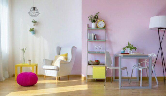
- Interior design: In the domain of interior design, pastel shades forge spaces infused with relaxation and tranquility, cultivating peaceful environments.
- Graphic design: Within graphic design, pastel colors orchestrate a visual symphony of softness and elegance, lending a gentle yet sophisticated touch to creations.
Conclusion
Pastel colors are a popular choice in design and fashion. They are soft, muted colors that are created by adding white to primary or secondary colors. Pastel colors are often associated with calmness, relaxation, and serenity. They can be used in a variety of ways in design, including as accents, in a monochromatic color scheme, or paired with bold colors.
FAQs
What are pastel colours?
Ans. Pastel colors are soft, muted colors that are created by adding white to primary or secondary colors.
What is a pastel colours palette?
A pastel color palette combines two or more pastel colors that go well together.
What are some popular pastel colours?
Some popular pastel colours include pink, blue, green, yellow, purple, and orange.
What is the psychology of pastel colours?
Pastel colors are often associated with calmness, relaxation, and serenity.
How can I use pastel colors in my designs?
Pastel colors can be used in a variety of ways in design. They can be paired with neutrals, used as accents, or combined with bold colors.
What is the difference between pastel and neon colors?
Pastel colors are soft and muted, while neon colors are bright and bold.
What is the difference between pastel and muted colors?
Pastel colors are created by adding white to primary or secondary colors, while muted colors are created by adding gray to primary or secondary colors.
What is the difference between pastel and light colors?
Pastel colors are soft and muted, while light colors are simply colors that are not dark.
What is the difference between pastel and pale colors?
Pastel colors are soft and muted, while pale colors are simply colors that are light in shade.
What is the difference between pastel and washed-out colors?
Pastel colors are soft and muted, while washed-out colors are colors that have lost their vibrancy.
| Got any questions or point of view on our article? We would love to hear from you. Write to our Editor-in-Chief Jhumur Ghosh at jhumur.ghosh1@housing.com |