


Warm tone colours such as reds, oranges and yellows exude an inviting and lively sensation. Such colours remind us of the sun, flames and the varying reds and golds of autumn leaves. Warm colours are very influential in how we feel. Reds are exciting, oranges are warm and enthusiastic, while yellow signifies optimism and energy. The colours that create the stimulus and sense of belonging are primarily used in interior design, branding and arts. Historically and cross-culturally, warm colours have been necessary. Vitality, celebrations and symbolic meaning are some factors they have been associated with. This shows the richness and diversity of the human experience because different cultures attribute different meanings to these colours.
See also: Exploring charcoal colours for home decor


Warm tone color: Popular types
-
Radiant reds: Passion and energy
Red is an intense colour, and it is used to denote the emotions of love and excitement. It is bold and dramatic and evokes powerful emotions.
-
Golden hues: Elegance and luxury
The golden colours, such as yellows and ambers, represent warmth and richness. They enhance it and give it an air of elegance, hence sophistication and class.
-
Earthy browns: Stability and warmth
They are earthy, warm and grounding browns. They provide security and are often used in natural or earthy designs.
-
Invigorating oranges: Vibrancy and creativity
Orange represents energy and creativity. It makes the designs spicy, fun and happy.
-
Yellows: Sunshine and positivity
Yellow represents sunshine, positivity, happiness and energy. It usually gives a cosy and comforting feeling and is generally used to portray optimism.


Science behind warm tone colour
Reds and yellows are examples of warm colours because they have low colour temperatures and resemble the warmth of the light from the sun or a candle flame. Such colours can be arranged in the colour wheel’s red, orange and yellow parts.
They have stimulating and energy connotations. Light is crucial in improving warm tones: natural sunlight enhances its intensity, while artificial light affects the ambience of indoor spaces. Colour temperature, placement on the colour wheel of warm tones and the effects of light eliciting specific emotions to improve visual experiences.
Warm tone colour: Unique characteristics
- Warm tones include reds, oranges, yellows and browns. This is a reference to sunlight, fire and earth, which are symbolised by the colours.
- These evoke warm feelings, energies and positivity and are called warm colours. Usually, such words are linked with emotions of joy and excitement.
- Warm tones make a space feel cosy. They are often used where people assemble, creating a warm environment.
- Visual Advancement: Warm colours typically project forward or recede in a space. This property can focus attention on specific areas in the space.
- As for design versatility, warm tones comprise several shades and intensities. Warm colours can be soft or bright.
- Warm tones such as beige, orange and brown are timeless/classic. They blend perfectly with modern and old designs, hence familiar and timeless.
- Warm colours are usually coordinated with each other, thus making it easy to develop harmonious colour schemes. A good balance can be achieved by pairing warm tones with neutral or cool colours.
- Warm tone colour may be used to improve the mood of the space. Warm colours create a colourful, animated ambience or a peaceful, calm refuge.


Warm tone colour: In art & design
Classic use in traditional art
- Reds, oranges, and yellows have traditionally been used in conventional art to express feelings and create points of emphasis.
- During Renaissance paintings and impressionist artworks, warm colours have been important in showing passion, energy and depth.
Modern applications in graphic design
- In graphic designs, warm tones are utilised for modern, exciting and eye-catching visuals.
- For excitement, brands use reds and oranges, while yellows are used for positivity to produce memorable designs in digital media and branding.
Warm colour palette in interior design
- Interior designs typically adopt warm colour schemes to make areas appear friendly and homely.
- Reds in accents, orange in textiles, and yellow in decor elements bring warmth and personality to rooms, especially for warm living rooms.

Warm tone colour: Combinations and balance
Mixing warm tones with other colours is about striking the correct balance and combining with neutrals such as classic whites or grounded beiges. Add a little contrast and boldness to warm tones by pairing them with cool blues or deep purples. To maintain a balanced colour scheme, combine one warm shade with neutrals or cool tones.
Furthermore, strategic accessorising and observing proportions make a harmonious and beautiful image. Warm tones can be used together or separately, and they can experiment with unexpected pairings or classic contrasts for varied and chic colour combinations applicable to both fashion and design.
Challenges and considerations with warm colors
Maintaining warm colours over time
Warm colours of red and orange can fade over time and should, therefore, be considered as far as sunlight and preservation materials.
Cultural variations in warm colour symbolism
Warm colours also vary culturally depending on the particular colour; for example, for some, red could mean luck or danger, and yellow may signify death or life, among others. Therefore, designers must pay attention to these variations for positive cross-cultural acceptance.
Challenges in design and art
They also come in warm colours, which can be visually intense and, therefore, difficult to balance in design and intensity. Strategies that include adopting neutral tones or warm shades with low saturation help prevent visual overwhelm.

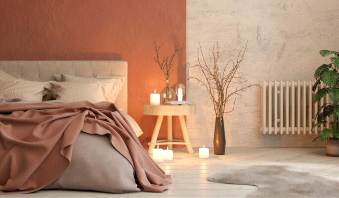
How to use warm-tone colours in your house?
- Warm colours such as red, yellow, orange and brown can help to give your house a warm, friendly comfy feel to it.
- Paint one wall in a warm, strong colour. It becomes an eye-catcher and animates the room.
- Use warm-coloured furniture–oak or walnut woods, for example. That makes the whole space seem comfortable and natural inside.
- Put warm-coloured things such as soft pillows, blankets and curtains in your rooms. You can easily change them to make your space look different.
- Put in soft white lights. Like having sunshine indoors, it makes the house all cosy and comfortable.
- Hang colourful pictures in your home or put things around in red, orange or yellow. It adds a lively touch.
- Avoid artificial, manmade materials. In addition, select fabrics in warm colours. It gives your home a good feeling of realism.
- Decide where warm colours fit best. Living rooms and bedrooms are great for a warm, relaxing vibe.
- Experiment with different shades of warm colours. Light peach or dark burgundy – see what feels good to you.
FAQs
Do warm-tone colours disappear as time passes by?
Yes, warm colours, especially reds and oranges, will tend to fade over time. Their vibrancy depends on factors like exposure to sunlight and the choice of materials used.
What effect do warm tones have on interior design?
Interior design, especially in living spaces, uses warm tones to create friendliness and the feel of the home.
Are warm colours more expensive?
Prices differ, but warm colours are approximately equal to or better than other options and suitable for different budgets.
Do warm colors have cultural significance?
Certainly, warm colours may be culturally specific. For instance, red may denote luck, danger, or life, and yellow may portray life or even death.
Should warm tones be applied on walls as well as furniture in a room?
Yes, warm tones to be applied on walls and furniture will create a homogenous and appealing ambiance of space.
Is there a particular warm colour recommended in calm environments, especially bedrooms?
It is advisable to use earth tones like soft browns and muted reds to create a calm and comfy bedroom feel.
| Got any questions or point of view on our article? We would love to hear from you. Write to our Editor-in-Chief Jhumur Ghosh at jhumur.ghosh1@housing.com |