For homeowners who desire bold and energetic interiors, jewel tones are the ideal choice. These bright and rich hues inspired from precious gemstones offer the perfect balance between a sense of opulence and dynamic vitality. However, the richness of jewel tones can often become overpowering if not incorporated properly. So it is best to use them in combination with other shades to ensure proper balance and visual appeal. In this article, we will explore some popular interior decor colour combinations involving jewel tones that are in vogue in 2025.
See also: Role of luxe colours in your home décor
Emerald green and sapphire blue
This lush pairing inspired from the soothing tones of nature exudes sophistication and calm. By adding shine on velvet furnishings, as statement walls, or as grounding hues, this combination adds timeless elegance to modern and classic interiors.

Source: Pinterest dailyjoysandjourneys/47358233576905469

Source: Pinterest homecompanionmag/965881451325282936
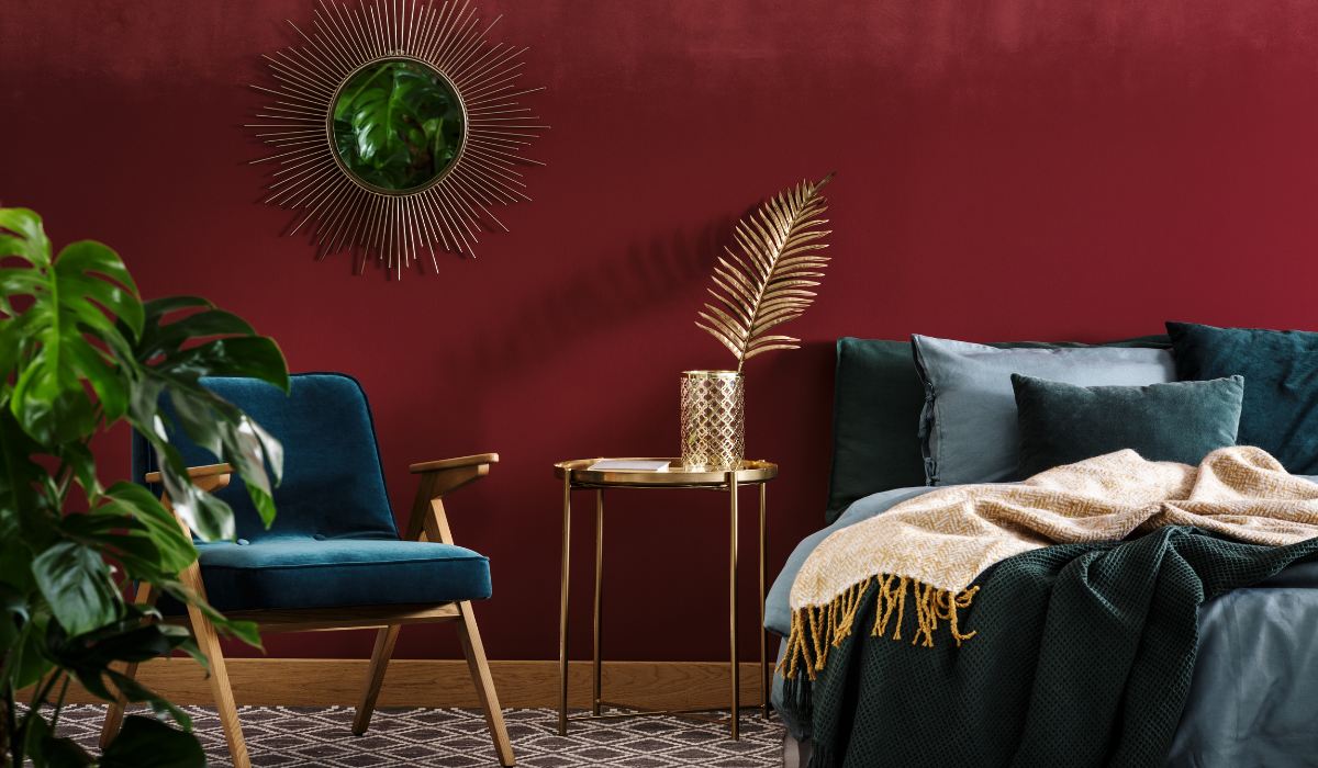
Amethyst purple and ruby red
If a sense of drama and artistic flair is what you desire, this regal and bold combination is just for you. It infuses energy and opulence and strikes the perfect balance between vibrancy and sophistication, making it ideal for dining rooms and bedrooms.

Source: Pinterest CovermyCushion/1095500678091264112

Source: Pinterest Mansionshots/383087512072772267
Topaz yellow and onyx black
The bright boldness of topaz yellow, when paired with the grounding neutral onyx black, creates a striking contemporary duo combining cheer with sleekness. Ideal for statement pieces and modern designs, it can add a sense of depth and visual drama without feeling overwhelming.

Source: Pinterest mechellecook66/67413325666159594

Source: Pinterest VelvetSky07/288652657385074609
Garnet red and smoky quartz brown
Combining the richness of garnet red with the earthy calm of smoky brown tones, this pairing brings a warm, moody and vintage-inspired vibe. Create a cosy, upscale setting with a timeless and nostalgic feel with this combination.

Source: Pinterest NinianeArt/2814818511366988

Source: Pinterest hausgartentrends/94505292176302746
Teal and citrine yellow
Oozing energy and creativity, this vibrant duo offers a burst of freshness to the space. These tones work beautifully on statement walls, textiles or furniture, balancing boldness with visual harmony.

Source: Pinterest toolzview/599893612900082562

Source: Pinterest designingidea/440086194856401302
Sapphire blue and plum purple
This deep and monochromatic pairing creates immersive and opulent interiors, reminiscent of nighttime serenity and moody luxury. Make elegance meet drama in your bedrooms and living rooms with this regal pairing.

Source: Pinterest rhythm_of_the_home/337770040826206259

Source: Pinterest hausgartentrends/909867930963914627
Emerald green and turquoise
This soothing yet invigorating palette seeks inspiration from natural hues and mirrors lush forests and crystal-clear waters. This balance of luxury and freshness is desirable in kitchens, bathrooms or other spaces where calmness is a priority.

Source: Pinterest flickr/9359111714473457

Source: Pinterest aaylasecura/240379698847559286
Ruby red and gold accents
A timeless and glamorous pairing, ruby red paired with gold combines passion and opulence that is desirable in decor focal points or furnishing. This pairing exudes grandeur and adds a refined, luxurious touch to the space.

Source: Pinterest soulafkh00/467741111321072439

Source: Pinterest LuxuryLivingco_/87538786501452307
Aquamarine and amethyst
Bring dreamy elegance and calming energy to living spaces with this serene and cool pairing. Ideal for soft furnishing, bedrooms or cosy relaxation nooks, this combination benefits spaces that call for tranquillity.

Source: Pinterest mrzyollie/37858453112473295

Source: Pinterest etsy/468937379965037991
Deep jade and charcoal grey
Combining the vibrancy of deep green with the sleek neutrality of charcoal grey, this pairing offers a contemporary and earthy twist to spaces. It adds sophistication and grounded balance to modern interiors, making it perfect for minimalist designs.

Source: Pinterest insteadoffix/1031535489653105899

Source: Pinterest thenestory/196328865000206062
Cobalt blue and citrine yellow
Energise your space with this bold and vibrant pairing. The deep, striking blue beautifully complements the bright, sunny yellow to result in an invigorating and modern look for living rooms or kitchens.

Source: Pinterest omnihomeideas/310678074313972301

Source: Pinterest learncalifornia/1128292512892550853
Rose quartz pink and emerald green
This soft, romantic combination is the perfect balance of warmth and coolness. While the pastel pink adds a gentle touch of sweetness, the deep green brings an earthy, grounded element, making it ideal for bedrooms or serene living spaces.

Source: Pinterest WestMagnoliaCharm/284923113919012080

Source: Pinterest interiorthemes/588634613828526932
Turquoise and coral
Bring home the vibe of tropical natural environments with this lively and refreshing combination. The cool turquoise comes together with the warm, energising coral, creating a playful yet sophisticated look for bathrooms and lounges.

Source: Pinterest learncalifornia/97249673200188650

Source: Pinterest interiorinfo/46936021112422538
Opal and deep violet
Opal provides the effect of shifting light against the richness of deep violet, creating a soft contrast and bringing a mystical and ethereal vibe. This pairing is especially recommended for creative spaces like art rooms, and eclectic decor schemes.

Source: Pinterest HomeWallArtDecor/401172279325425106

Source: Pinterest bilalhassan13460049/970666525927751270
Peridot green and amethyst purple
The zesty feel of peridot green comes together with the luxurious tones of amethyst purple to result in a striking and vibrant pairing. This duo is perfect for adding a burst of colour to living rooms or accent walls without compromising sophistication.

Source: Pinterest houzmark/963770389014152547

Source: Pinterest jannniezen/79024168455275366
FAQs
Why are jewel tones trending in 2025?
Jewel tones are trending in 2025 because they strike balance between modern and classic aesthetics by adding depth and luxury to spaces.
Which jewel tone combinations are best for small spaces?
Emerald yellow with turquoise and teal with citrine yellow can brighten small rooms without overwhelming and create visual interest.
How can I incorporate jewel tones without overwhelming my space?
Using jewel tones as accents and pairing bold colours with neutrals or metallic accents can soften the overall look.
Are jewel tones versatile enough for different design styles?
Jewel tones can compliment various styles depending on the specific hue, ranging from natural and botanical, to vintage and glam, without compromising sophistication.
What jewel tone combinations pair well with neutrals?
Combinations like sapphire blue with charcoal grey and topaz yellow with onyx black provide a balanced look while adding depth and elegance to neutral palettes.
What rooms benefit most from jewel tone combinations?
Living rooms, dining rooms and bedrooms benefit from the luxurious, sophisticated and serene pairings of jewel tones.
Are jewel tones suitable for seasonal changes?
Jewel tones offer year-round versatility, especially when paired with pastels or metallics in summers and with warm textures in winters.
| Got any questions or point of view on our article? We would love to hear from you. Write to our Editor-in-Chief Jhumur Ghosh at jhumur.ghosh1@housing.com |