When decorating, elements like designs and efficient use of space play a significant role, but do you know what influences the entire look? Colours—you got it right! The use of colours gives a facelift to the final appearance of a space, transforming it from plain vanilla to exquisite. In this pictorial guide, we will detail the impact that luxe colors have on your home by setting the right mood and emotion, and providing you with the visual experience you have envisioned.
What are luxe colours?
Luxe colours are colours that evoke a sense of luxury, opulence, and sophistication. These are typically rich, deep, and elegant, colours and are often associated with high-end or upscale environments.
What are the different ranges that luxe colours are available in?
| Rich jewel tones | Emerald green, sapphire blue and amethyst purple |
| Neons | Neon pink, neon green, neon orange |
| Soft pastels | Blush pink, powder blue, lavender |
| Rich neutrals | Cream, champagne, grey |
| Metallic | Silver, gold, copper, bronze |
Why to use luxe colours in home decor?
Luxe colours have a positive impact on your home décor.
Sophistication
These colours create an atmosphere of refinement and elegance making the space feel more opulent and stately. Deep rich tones like burgundy, emerald or navy blue play a significant role in uplifting the mood and adding an air of importance.
Sense of calm
Colours such as muted gold, mush cream, charcoal grey give way to an airy space thus contributing to tranquility and serenity. These shades are mostly used in bedrooms or lounges which demand a peaceful, calming atmosphere.
Warmth
Darker luxe colours such as deep browns, dark greys etc. that are intimate and cosy vibe provide a sense of warmth and are sought after in living rooms or study areas.
Inspiration and positivity
Use of dynamic, energetic colours such as red ruby, royal blue stimulate the mind and foster creativity and are ideal for home offices or creative spaces.
Element of glamour and luxury
Positivity and excitement oozes out of luxe colours making a space more indulgent and special. Metallics such as gold, silver or bronze are used as accents for a touch of brilliance.
Balance
Soothing colours such as blush pink, mint green etc. offer a sense of harmony and balance by creating a serene, harmonious atmosphere.
Palette examples
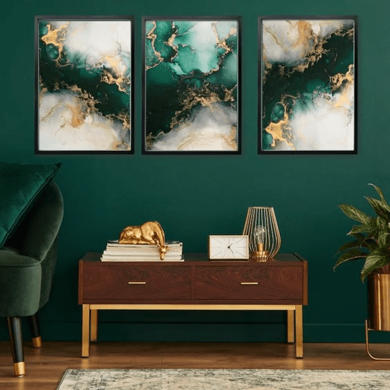
Emerald green, gold and cream
- Emerald Green (deep, jewel tone)
- Gold (metallic accent)
- Cream (soft neutral)
Can be used in:
- Living room: An entire bold living room look can be created with Emerald Green walls and velvet furniture. The dramatic look will be further accentuated with the use of gold in lighting fixtures, picture frames, or side tables for opulence. Finally, you can soften the intensity and balance richness with cream sofas, rugs or curtains.
- Dining room: Use Emerald Green as the primary wall colour. This can be combined with Gold-trimmed dining chairs and a Marble table with Cream veins to introduce subtle luxury; Adding Gold utensils or tableware will highlight the opulence.
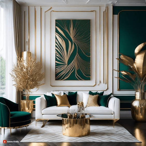
Source: Pinterest bedroominteriordesignforkids/478648266665108920
Source: Pinterest etsy/478648266665108920
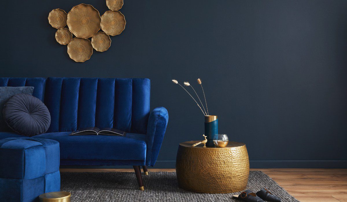
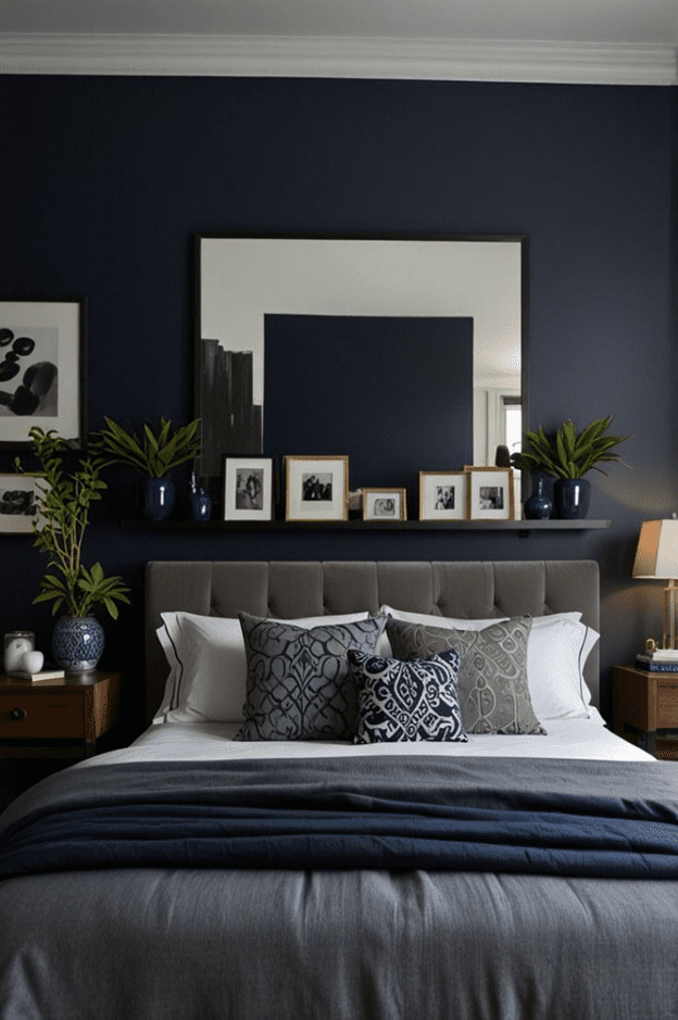
Navy blue, silver, and charcoal grey
- Navy Blue (deep, regal tone)
- Silver (metallic accent)
- Charcoal Gray (dark neutral)
Can be used in:
- Bedroom: Start with Navy Blue walls or bedding for creating a calming space with an upscale feel. Silver accents in bedside lamps, picture frames, or decorative trays will team up for luxury and Charcoal Grey curtains or upholstered headboards for elegant and moody backdrops.
- Office: Navy Blue walls paired with charcoal furniture will give a grounding effect stimulating focus. This with silver accessories like desk lamps, hardware or art frames for sleekness will give a chic look.
Source: Pinterest thedecorifi/1067282812004925629

Source: Pinterest burkedecor/194358540162214117
Blush pink, rose gold, and marble white
- Blush Pink (soft, feminine tone)
- Rose Gold (warm metallic accent)
- Marble White (cool neutral)
Can be used in:
- Bathroom: You can use Blush Pink on the walls or as accents in tiles; Rose Gold hardware such as faucets, towel bars, or light fixtures; marble white countertops, sinks, or flooring are trending and give a chic, luxurious feel and balanced appeal.
- Bedroom: Blush Pink bedding, curtains or throw pillows for softness and comfort is always welcome. This combined with Rose Gold through lighting or picture frames for luxury, Marble in small furniture pieces will complete the sophisticated look.

Source: Pinterest nextofficial/323696291981123781
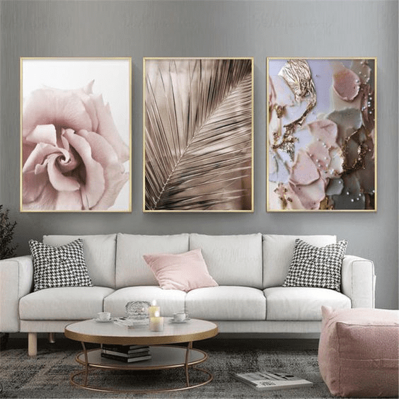
Source: Pinterest etsy/155303888017217045
Rich burgundy, brass, and ivory
- Burgundy (deep, opulent tone)
- Brass (warm metallic accent)
- Ivory (light neutral)
Can be used in:
- Living Room: Choose Burgundy velvet sofas or accent chairs for warmth and richness. For a vintage luxe vibe, brass light fixtures, coffee tables, or mirror frames can be opted. This can be teamed with Ivory walls or area rugs that will help balance the depth, keeping the room from feeling too heavy.
- Dining Room: Burgundy on walls or upholstered chairs add drama; Next, Brass accents in chandeliers or cutlery will add opulence to the look. Finally, an ivory tablecloth or ceramic dinnerware for lightness will prevent the space from getting dark.
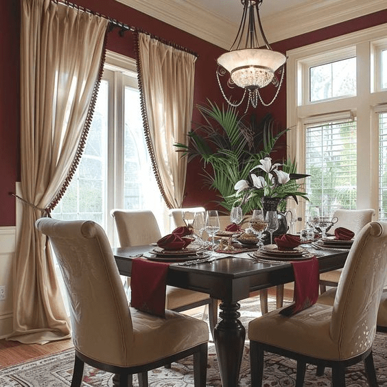
Source: Pinterest ArtFacade/390687336463237030
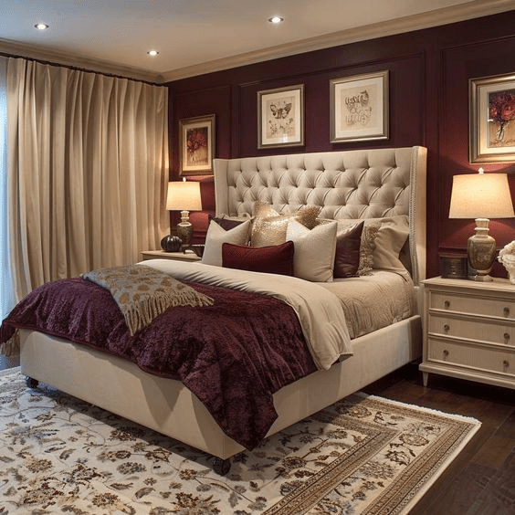
Source: Pinterest ArtFacade/67131850690509451
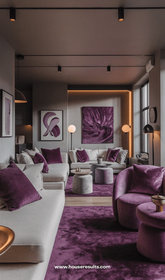
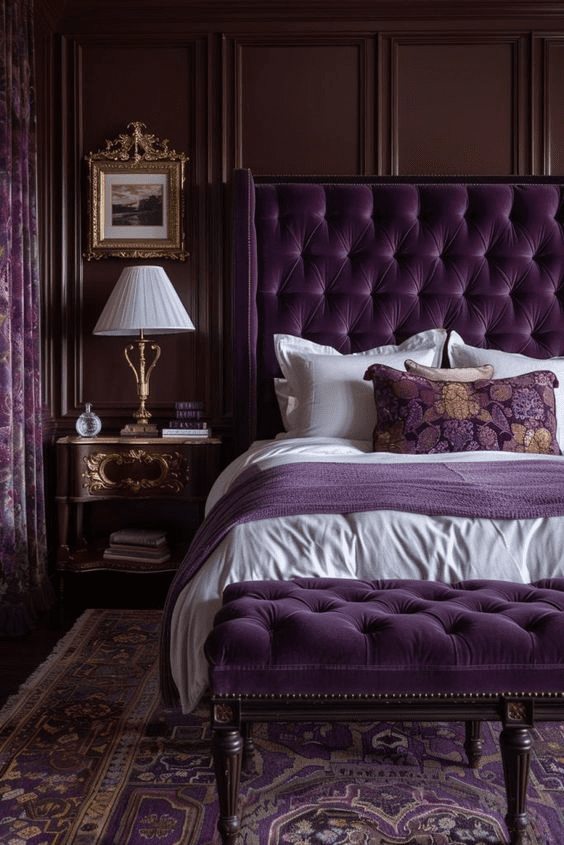
Amethyst purple, gold, and dove grey
- Amethyst Purple (royal jewel tone)
- Gold (metallic accent)
- Dove Gray (soft neutral)
Can be used in:
- Bedroom: Amethyst purple bedding or drapes for intimate, luxurious space; gold bedside tables, mirrors, or frames for elegance; dove grey walls or upholstered furniture to soften the vibrancy of the purple for harmony.
- Lounge Area: Amethyst in accent walls or statement furniture pieces; gold finishes on coffee tables or art frames; dove grey throws, rugs, or side chairs to introduce comfort and balance.
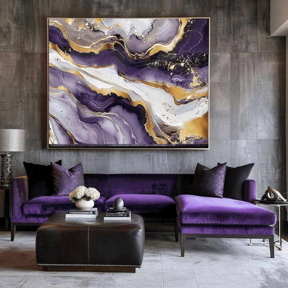
Source: Pinterest etsy/155303887986691887
Source: Pinterest allanamaral47/696017317442259569
Black, champagne gold, and warm beige
- Black (bold, grounding tone)
- Champagne Gold (subtle metallic accent)
- Warm Beige (soft neutral)
Can be used in:
- Dining Room: Opt for Black chairs or cabinetry paired with champagne gold hardware for a striking, modern look. Next use Warm Beige rug or curtains to the boldness of the Black that will help maintain an elegant, luxe feel. Finally, a champagne gold cutlery or table decor will enhance the glamour without overwhelming the space.
- Bathroom: Choose Black tiles or a black vanity for a modern, high-end feel; Use Champagne Gold fixtures such as faucets, towel racks, or mirrors for refinement; Finally incorporating Beige Marble or Neutral tiles to keep the space grounded and elegant.

Source: Pinterest TrendyNestHomie/261842165831036870
Source: Pinterest TheStyleDiary/21744010694920756
Plum, bronze, and ivory
- Plum (rich, moody tone)
- Bronze (warm metallic accent)
- Ivory (soft neutral)
Can be used in:
- Living room: Opt for Plum Velvet curtains or accent walls for intimacy. Team this with Bronze light fixtures, coffee tables or decorative objects for a rustic, warm metallic sheen. Finally use ivory sofas, rugs or side chairs to lighten the space.
- Entryway: Use a plum-painted entry door or walls for a welcoming statement; Pair this with Bronze Hardware and accents in mirrors or lighting fixtures for richness; Doing this with Ivory flooring or décor ensures a bright and inviting space.
Source: Pinterest wallpaperdirect/89157267619131700
Source: Pinterest courtneysworldblog/542965298843388746
| Got any questions or point of view on our article? We would love to hear from you. Write to our Editor-in-Chief Jhumur Ghosh at jhumur.ghosh1@housing.com |