In interior decor, when it comes to accents, a striking and visually pleasing quality is always the top priority. Alongside, it is also important to ensure that the accents complement each other as well as the overall decor theme for a unified, cohesive look. While the type of accent suitable for your space is subject to the existing decor and personal preferences, a sure shot way of ensuring that it appeals to sight is by using unique colours. In this article, we will explore some unconventional colours you can deck up your accents with to truly make them stand out.
See also: Trendy accent ideas for neutral-themed spaces 2024
Burnt orange
A deep and earthy shade of orange with a hint of brown, this shade is ideal if a rustic and autumnal feel is what you are looking for. It is warm and inviting, and reminiscent of cosy firesides and autumn leaves. It goes admirably with neutrals like beige or grey, as well as complementary shades like teal or navy. Go for it especially if you wish to add warmth to a cooler colour palette or bring some vibrancy to a more muted palette.
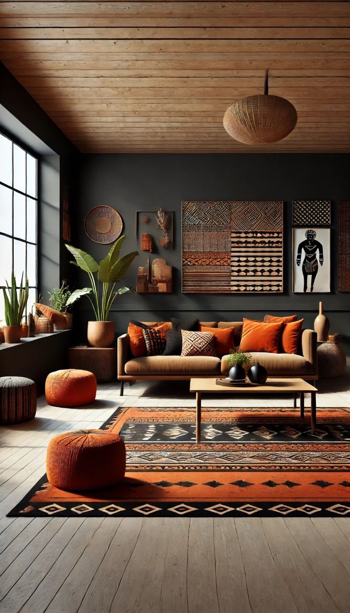
Source: Pinterest @BibliophileBungalow
Teal
This sophisticated blend of blue and green has a slightly dark and rich quality to it. The sense of tranquillity and depth it evokes resembles tropical waters or lush forests. It works equally well with both warm and cool tones. For a vibrant look, it is recommended to pair it with coral or with grey or white to achieve a more serene, modern feel.

Source: Pinterest @greensnooze
Deep plum
A dark, rich shade of purple, deep plum exudes a luxurious sense of elegance and mystery. The slightly reddish undertone serves to add just the right amount of warmth to its otherwise cool base. Enhance the regal visual effect of the shade by combining it with gold or brass. For a more balanced, sophisticated space, go for lighter greys and pinks.

Source: Pinterest @upgradesign
Mustard yellow
This deep, golden yellow has a slightly brownish tint. The bold and warm vibe of the shade evokes images of autumn and sunlit fields. Its vibrancy is best balanced by pairing with cool colours like navy and teal. However, it also works equally well with other warm tones like burnt orange and rich browns to give the space a sense of energy and vitality.

Source: Pinterest @veyosow00000000000000
Chartreuse
An energetic and vibrant shade, chartreuse is characterised by its bright, eye-catching mix of yellow and green. It is bold and modern, easily making a strong statement in any design. When used with darker colours like charcoal or navy, it creates a sharp and visually striking contrast. It also pairs well with neutrals like white or grey to achieve a balanced level of intensity.

Source: Pinterest @shelterness
Slate blue
This muted greyish-blue has a calm and sophisticated quality to it. Subtle yet strikingly distinct, it is often used to achieve an aesthetic that is serene yet modern. It is best combined with whites, creams or other muted tones for a harmonious look, or deeper colours like burgundy or forest green for an intense and dramatic effect.

Source: Pinterest @lick
Copper
The warm metallic of copper with reddish-brown tones is highly preferred for a touch of elegance and richness. Moreover, it has a reflective quality that can brighten up any space. Copper can be paired with a host of shades, ranging from deep greens to navy blues to earth tones. It works equally well with neutral shades like white, grey and beige that further accentuate its metallic sheen.
Source: Pinterest @nancyshomedecor
Emerald green
This bold and luxurious jewel tone flaunts a vibrant, deep green resembling the lushness of gemstones. It is a shade generally associated with richness and vitality. Emerald green admirably complements gold, white and black for a striking contrast. Moreover, you can also use it with other rich tones such as burgundy or navy.

Source: Pinterest @magnolia119blog
Dusty rose
The elegant and understated dusty rose is characterised by a soft, muted pink with a grey undertone. It is preferred for the touch of warmth and softness it adds without seeming overly vibrant to the eyes. Pair it with neutrals like grey, white and beige or with other muted tones like sage green or light blue to retain the gentle and cohesive look.

Source: Pinterest @donna738475
Cerulean blue
Super fresh and invigorating, cerulean blue is a bright and clear shade with a hint of green, reminiscent of clear skies and tropical seas. It works well in contrast with warm colours like orange and yellow and also complements neutrals and cool tones such as grey and white.

Source: Pinterest @courtneysworldblog
Lavender grey
This soft blend of purple and grey has a calm, refined quality to it, making it a gentle and modern alternative to more traditional neutrals. Among light colours, it pairs best with white and silver, and also with deeper shader like navy and plum for added depth.

Source: Pinterest @rio423
Coral
A vibrant and warm mix of pink and orange, coral is an energetic and playful tone, often associated with tropical environments and summer. To retain its vibrancy, it is recommended to pair it with blues and greens. You can also consider using it with neutrals like beige and grey to tone down its intensity while maintaining its lively essence.

Source: Pinterest @coordonne
FAQs
What makes an accent colour unconventional?
Less commonly used colours that make a bold statement or unique character make an accent colour unique. They stand out as they are not the traditional colour choices.
How do I choose the right unconventional colour for my accents?
Consider the ambiance of the space and the existing colour palette to pick a shade that can complement or contrast these factors effectively.
Can unconventional accent colours work in small spaces?
For small spaces, opt for a single bold accent wall or small accessories in the chosen colour to avoid overwhelming the space.
How can I incorporate unconventional accent colours without overwhelming the room?
Use the colours in moderation, preferably through smaller elements to create focal points without dominating the entire space.
What are the best ways to use unconventional colours in combination?
Avoid combinations that clash harshly or disrupt visual harmony, such as extremely bright colours paired with equally intense ones. It is best to balance them with neutrals.
Are unconventional accent colours suitable for both modern and traditional interiors?
While unconventional colours can be used as bold statements or minimalist accents in modern settings, traditional interiors can benefit from their introduction through classic elements.
How can I effectively use metallic or vibrant colours?
Metallic colours should be used sparingly to highlight specific features or add a touch of elegance, whereas vibrant colours must be balanced properly with neutrals.
| Got any questions or point of view on our article? We would love to hear from you. Write to our Editor-in-Chief Jhumur Ghosh at jhumur.ghosh1@housing.com |