The festival of lights will remain incomplete without appealing and vibrant decor. From colourful rangolis to shimmering lights, Diwali decor is all about adorning your space with as many colours as possible. Read on to explore some of the most popular and visually stunning colours you can incorporate in your Diwali decor to make the festival of lights even more special.
See also: How to decorate your home this Diwali?
Gold and red
The prosperity, wealth and divinity represented by gold, when combined with the power and energy of red, come together to embody the spirit of abundance, celebration and new beginnings. Combine gold candle holders and painted diyas with red flowers to achieve a luxurious and warm ambiance. Red drapes with gold accents and gilded frames can result in a striking contrast.
Source: Pinterest @geethmohandas
Orange and yellow
These hues signify the ideals central to the spirit of Diwali, namely warmth, light and positivity. They are often associated with natural light sources like sun and fire that drive away darkness and gloom. Think marigold garlands, yellow lamps and orange flower rangoli designs at the entrance of homes or temples. Achieve a bright and inviting atmosphere by pairing these tones with white or gold accents.

Source: Pinterest @etsy
Purple and maroon
Symbolising nobility and wisdom, purple can be combined with the powerful maroon. These rich and deep hues add a sense of grandeur and depth to the festive season. Soft textiles, such as purple cushions and maroon drapes, and dark-coloured lanterns can provide a rich and luxurious look. The richness of the shades goes particularly well with metallics like bronze and gold for enhanced impact.
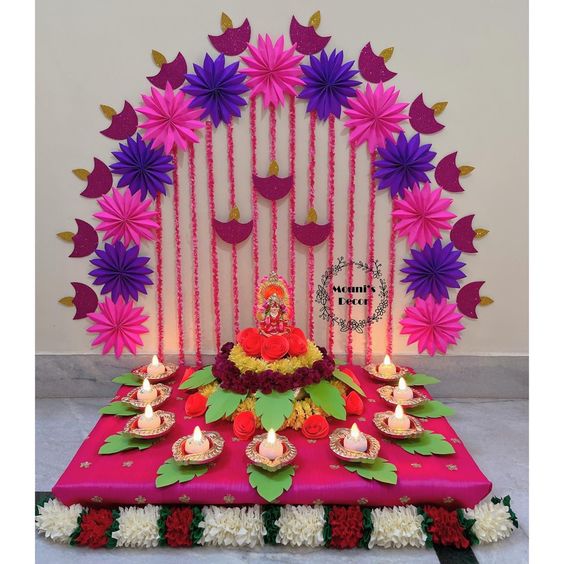
Source: Pinterest @mounisdecor
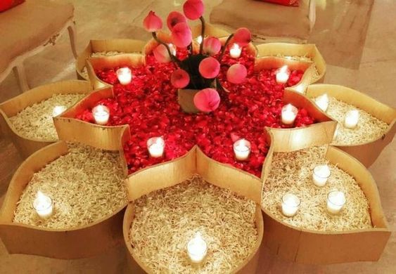
Bright pink and green
Pink stands for joy and playfulness, while green is symbolic of growth and new beginnings. This palette excellently reflects both the celebration of life and new opportunities. They go well in the form of floral arrangements and wreaths, especially in the combination of roses and leaves. If you want a fresh and modern look, opt for pink fairy lights with green decor pieces like vases or candles.
Source: Pinterest @shraddhajaythak
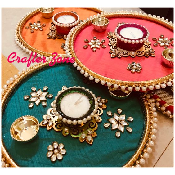
Gold, silver and copper
When we think of metallics, elegance and luxury comes to mind. The ability of metallic shades to reflect light creates a shimmering effect, making it ideal for Diwali decor. Use metallic diyas, lamps, lanterns and wall hangings in abundance. Go all the way for that opulent touch by using gold and silver confetti and sequined tablecloths. Additionally, metallic-painted clay lamps can add a traditional yet festive flair.

Source: Pinterest @ambikasuman
Terracotta, ivory and beige
Natural tones represent a link to the earth and nature, evoking a sense of simplicity, purity and calmness amidst the festival’s busy energy. Terracotta diyas, earthen pots or beige drapes can result in a minimalist and natural look. They pair beautifully with ivory candles and soft white fabric backdrops. Handcrafted or artisanal pieces can also bring an authentic, grounded feel to the occasion.

Source: Pinterest @ecoposseproducts
How to choose the right Diwali decor colour palette for your home?
Selecting the right colour palette for your Diwali décor depends on your home’s overall design, size, and the atmosphere you want to create. While traditional hues like gold, red, and orange never go out of style, blending them with modern shades or neutral backdrops can help achieve a balanced and elegant festive look. Here are a few tips to guide your choice:
- Match your décor style: If your home has a traditional interior with wooden furniture or ethnic accents, go for rich and warm colours such as red, maroon, or gold. For minimalist or modern spaces with muted tones, opt for metallics like copper and silver or soft pastels to maintain harmony.
- Consider the lighting: Diwali is the festival of lights, so your colour palette should enhance illumination. Warm tones such as gold, yellow, and orange reflect light beautifully, making spaces look brighter. If your lighting setup is already vibrant, balance it with neutral shades like ivory or beige.
- Use contrast wisely: Pairing contrasting colours can create depth and visual interest. Combine bold shades like purple with metallics or balance bright hues like pink and green with white or beige accents to prevent the décor from feeling overwhelming.
- Factor in the size of your space: Smaller rooms benefit from lighter shades that make the area feel open and airy. In larger living rooms or balconies, deeper tones like maroon, peacock blue, or terracotta can add warmth and a festive charm.
- Add a personal touch: Your colour palette should reflect your personality and festive spirit. Experiment with combinations, perhaps pastel pink with gold for a soft modern look, or terracotta and mustard for an earthy, traditional vibe.
- Balance tradition and modernity: Try mixing timeless Diwali colours with contemporary finishes, like pairing marigold yellows with matte gold lanterns or using red cushions on beige upholstery. The right balance can make your décor feel both rooted and refined.
Housing.com POV
In today’s homes, Diwali décor has evolved beyond the conventional mix of bright reds and golds. Modern homeowners are increasingly blending traditional vibrancy with contemporary aesthetics, creating festive spaces that feel both elegant and personal. The focus has shifted towards thoughtful colour combinations that complement existing interiors while still capturing the joyful essence of the festival.
From earthy terracotta tones that echo sustainability to metallics that add a touch of opulence, every palette tells a story of how design and culture can coexist beautifully. The trend toward eco-friendly and minimal décor also reflects a growing appreciation for mindful celebrations that are high on warmth but low on excess.
Ultimately, the perfect Diwali colour palette is not about following rules. It’s about finding hues that resonate with your home’s personality and your sense of festivity. The most inviting spaces are those that radiate light, positivity, and the joy of togetherness.
FAQs
What are the traditional colours associated with Diwali decor?
Diwali decor generally includes bright and warm colours such as gold, red, orange, yellow and deep maroon.
How can I incorporate modern colour schemes into traditional Diwali decor?
Traditional colours can be blended with modern tones like pastels, rose gold or metallic accents for an eclectic look.
What are the most commonly used materials to display Diwali colours?
Silk, brocade, velvet and cotton fabrics in rich colours can be used for drapes, tablecloths or cushion covers.
Why are gold and silver most commonly used colours in Diwali decor?
Gold and silver represent wealth, prosperity and divine blessings, the central ideas symbolising the spirit of Diwali.
How can I create a minimalist yet festive Diwali decor?
Use a neutral palette with white, beige or ivory with pops of traditional colours like red, gold or orange, with a few elegant diyas and metallic accents.
What are some popular floral colours for Diwali decorations?
Yellow and orange marigolds, red roses and pink lotuses in the form of garlands or rangolis are popular Diwali decor flower choices.
Can I use cool colours like blue or green in Diwali decor?
While warm colours are dominant in the colour palette, cooler greens and blues can be used to add contrast and balance.
| Got any questions or point of view on our article? We would love to hear from you. Write to our Editor-in-Chief Jhumur Ghosh at jhumur.ghosh1@housing.com |