Pink is a delicate, rosy colour that is frequently connected to love, romance and femininity. It comes in a variety of tones, from pastel to vivid. Sensitive and upbeat, it elicits feelings of sympathy and affection. Pink can be found in flowers like cherry blossoms and roses in the natural world. Due to its adaptability, the colour is popular in branding, decor and fashion. Pink is a colour that is widely accepted and aesthetically pleasant because of its delicate charm and lively energy, which may be used to decorate spaces or adorn apparel.
See also: 10 must-try dark pink colour combinations for your home
How to make pink colour?
Red and white can be combined to create the secondary colour pink. You can change the ratio of red to white to get the exact shade of pink you want. Here are some methods for creating pink:
Combining white and red paint
Fill your palette halfway full of red paint to begin. Mix the red paint well before adding the white paint gradually. Till the desired shade of pink is achieved, keep adding white.
Combining different colours
To generate pink, you can also play around with different colour combinations. For instance, combining magenta and a tiny bit of yellow yields a vivid pink.
Types of pink colour
Pink comes in a wide range of tones and shades, from delicate pastels to vivid and striking hues.
The following are a few varieties of pink:
Bubblegum Pink: A vivid pink that is frequently compared to bubblegum in colour.
Soft Pink: A delicate pink that is frequently utilised in pastel colour schemes.
Warm Pink: A bright pink hue with strong undertones of yellow. It is a striking and eye-catching hue.
Pink Salmon: A pink that is warm, subdued and somewhat orange in hue, similar to the flesh of salmon.
Pink Coral: A pink hue with an orange undertone that is similar to coral reef colour.
Pink Blush: A soft, delicate pink that is frequently compared to a slight blush on the cheeks.
Pink Rose: A lovely, rosy pink hue that is usually connected to roses.
Vibrant pink: A striking shade of purplish-pink that is deeper than standard hot pink.
Mauve: A dusty or quiet pink that is a muted, pale purple-pink hue with a hint of grey.
Lavender Pink: A soft pink with a hint of lavender that incorporates both pink and purple characteristics.
Pink Millennials: A subdued, fashionable pink that’s sometimes referred to as a light, desaturated rose hue. In the 2010s, it became more well-known.
Vibrant Pink: A vivid and luminous pink that is frequently utilised in striking and captivating designs.
Pink Orchid: A pink hue with hints of purple that is reminiscent of the colour of some orchid blooms.
Shell Pink: A delicate, warm pink that has hints of peach or beige; it looks like seashells.
Pink Cherry Blossom: A soft, pastel pink that is reminiscent of cherry blossoms in bloom.
Best pink colour combinations for bedrooms
The ideal contrast colour for a pink bedroom will rely on the particular pink tint selected as well as the overall look.
- Cream/White and Pink combination for the wall: A calm and refined contrast can be achieved with white or cream for soft and pastel pinks, such as blush pink or pastel pink. This combination has a classic, uncluttered appearance.
- Gray and Pink combination for the wall: Different tones of pink go well with light or medium gray, giving the space a chic and contemporary vibe. Gray gives the pink a subtle contrast without taking over.
- Blue Navy and Pink combination for the wall: Light or medium pinks can be strikingly contrasted with navy blue. This mix keeps the space balanced while giving it more depth and richness.
- Brass/Gold and Pink combination for the wall/furniture: Think about adding brass or gold embellishments for a hint of warmth and glitz. Both pale and dark pinks might look good with these metallic tones.
- Green mint and Pink combination for the wall: Some pink hues go nicely with mint green, which makes for a vibrant and new contrast. This combo is especially well-liked for a bedroom that is younger and more whimsical.
- Black/Charcoal and Pink combination for the wall: Charcoal or black can be used to contrast with darker pink hues like fuchsia. This gives an elegant and daring appearance, particularly when done in a modern or eclectic style.
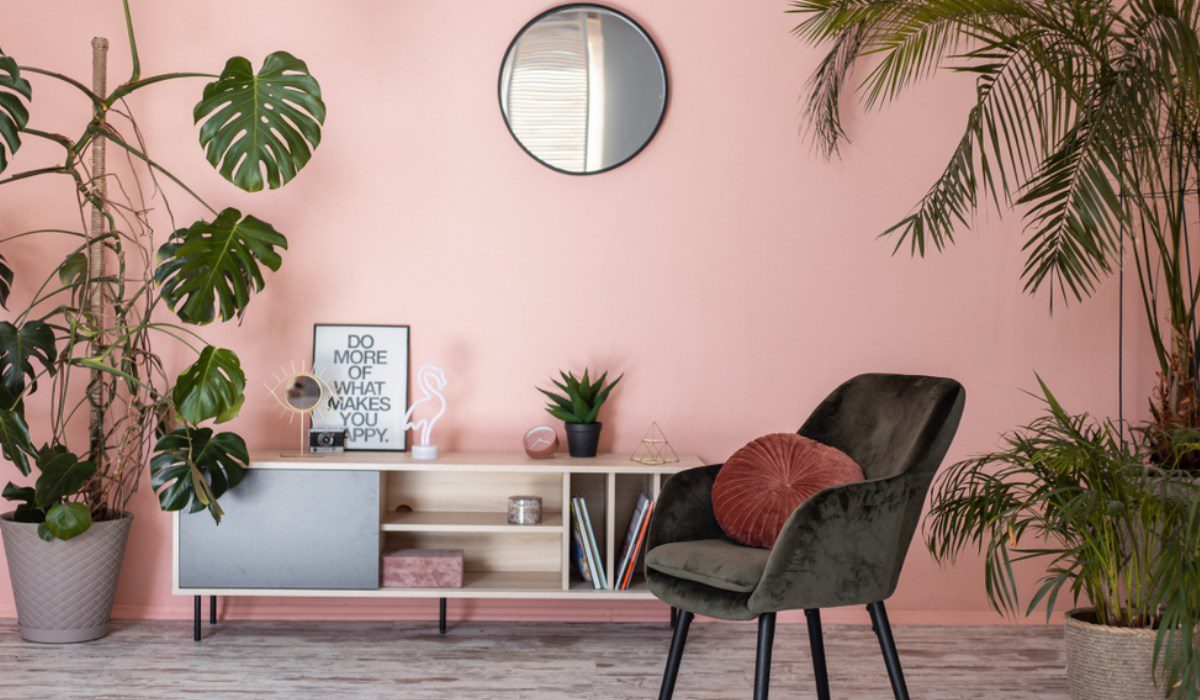
Best pink colour combinations for living rooms
- Navy Blue and Pink combination: When combined with different tones of pink, navy blue produces a chic and refined contrast. Both conventional and contemporary living room designs can benefit from this combination.
- Forest Green and Pink combination: When paired with some pink hues, deep green tones like forest green may produce an opulent and rich contrast. This combination works very well to create a warm and welcoming environment.
- Teal/Turquoise and Pink combination: Pink can look lively and invigorating when paired with teal or turquoise. Combinations like these look great in modern and diverse living room designs.
- Black and Pink combination: When used with different tones of pink, black may make a striking and dramatic contrast. When it comes to furniture, frames, and other design pieces, use black as an accent hue.
Best pink colour combinations for the dining room
- Green mint and Pink combination: When combined with certain pink hues, mint green can create a lighthearted and invigorating contrast that gives the eating space a little extra brightness.
- Peach/coral and Pink combination: Particularly when paired with softer pink hues, a monochromatic approach with peach or coral tones can produce a pleasant and coherent effect.
- Off-white/white and Pink combination: A stark contrast between white and off-white can create an air of openness and friendliness in the eating area. This combo is adaptable and suits a variety of design aesthetics.
How do interior designers use the pink colour?
Pink can be used by interior designers in many different ways, from strong colour splashes to engulfing a space in its cosy tones. Pink can be incorporated into a room’s design scheme by way of furniture and accessories, which will serve as highlights.Because of pink’s adaptability, designers can experiment with a range of hues and tones, from delicate pastels to striking hues, to suit the client’s intended mood and aesthetic preferences. Pink can be incorporated into a design concept to provide warmth, refinement and a dash of playfulness through textiles, wall colours or accent pieces.
Best practices for using pink colour
Interior design
When used as a contrast colour in home décor, pink may give rooms a sophisticated yet cosy feel. A space can be completely changed by adding accessories like accent walls, throw pillows, artwork, or soft pastel pinks, or vibrant fuchsias, especially when combined with neutral colours. Depending on the shade selected, pink can either provide a fun and energetic touch or a serene and calming ambiance.
Accessory and fashion
Scarves, purses, and statement jewellery are examples of accessories in different pink hues that can provide a flash of colour and create a striking contrast with neutral clothes. Pink accessories are a popular choice in the fashion industry because they are adaptable and can easily go from subtle and elegant to bright and current.
Branding and graphic design
Pink is frequently used in branding and graphic design to evoke feelings of warmth, charm, and approachability. Pink can be used as a contrasting colour in logos and marketing materials by brands who want to stand out and leave a lasting impression. Whether it’s a vivid magenta or a gentle, subdued pink, colour has the power to arouse feelings and establish a unique visual identity.
FAQs
What emotions does the colour pink evoke?
Pink is often associated with feelings of warmth, compassion, and love. Lighter shades convey sweetness and innocence, while bolder hues can evoke energy and excitement.
How to use pink in a home without it being overwhelming?
To avoid overwhelming a space, consider incorporating pink through accessories like throw pillows, artwork, or small accent pieces. Alternatively, use it as an accent colour in specific areas, such as an accent wall or selected furniture.
What are good colour combinations with pink in interior design?
Pink pairs well with neutral tones like white, grey, and beige for a balanced and sophisticated look. It also compliments navy blue, mint green, and metallics like gold or brass.
Can pink be a suitable colour for a masculine space?
Yes, pink can be used in a masculine space when paired with darker colours, such as charcoal grey or navy blue. The key is to balance the softer tones of pink with more neutral or muted hues.
Is pink only suitable for certain rooms in the house?
No, pink can be used in various rooms. Soft pinks can create a calming atmosphere in bedrooms, while bolder pinks can add energy to living rooms or creative spaces. Kitchens and bathrooms can also benefit from carefully chosen shades of pink.
How does lighting affect the appearance of pink in a room?
Lighting plays a crucial role in how pink appears. Natural light tends to enhance the vibrancy of pink, while warm artificial lighting can create a cosy atmosphere. It's recommended to test paint or fabric samples in different lighting conditions.
Can one use pink in a minimalist design scheme?
Yes, Soft muted pinks can add warmth to minimalist spaces without overpowering the simplicity. Consider using pink in small, intentional doses, such as through artwork or select furnishings.
What are popular shades of pink in fashion and design?
Millennial pink, blush, coral, and magenta are popular shades in both fashion and design. The choice of shade often depends on personal preference and the desired mood for the space or outfit.
How to make pink work in a professional or office setting?
In professional settings, consider using soft or muted pinks in moderation. This could include incorporating pink accents in office decor, such as desk accessories or artwork, to add a touch of warmth without being too bold.
Can pink be used in graphic design for branding purposes?
Absolutely. Pink is often used in branding to convey friendliness, warmth, and a modern aesthetic. It can be a memorable and attention-grabbing colour when used strategically in logos, marketing materials, and overall brand identity.
| Got any questions or point of view on our article? We would love to hear from you. Write to our Editor-in-Chief Jhumur Ghosh at jhumur.ghosh1@housing.com |


