
When decorating your home, furniture colour is an essential factor to consider. It affects the overall aesthetic of your space. From subtle shades to bold hues, there are endless possibilities when selecting furniture colours. Choosing furniture colours for your home can be a daunting task. With so many colours and combinations available, it is hard to know where to start.
Listed below are some exciting colour combinations that you can use to make your furniture stand out. Whether you’re looking for something classic and timeless or a daring and modern look, you’ll find plenty of inspiration here.
Furniture colours for a vibrant interior
Furniture colour can be a great way to bring vibrancy and personality to your space, whether you’re a fan of bright and bold or subtle and sophisticated. Choosing the right furniture colour can make all the difference in how your space looks and feels.
Vibrant hues for bold interiors

Vibrant tones always makes the entire room light up and look bright. You may take inspiration and place a furniture as shown above in your living space.
Natural tones for a serene space

You can opt for natural tones for a very fresh natural and calm space.
Mix and match colors for eclectic flair

For people who are fans of the eclectic decor, can opt for furniture pieces as shown above.
Monochromatic schemes for a chic look

Similar to the natural tone look, the monochromatic look is always evergreen and widely opted.
Jewel tones for a luxurious touch

An independent furniture in your living room in jeweled tones will look absolutely ravishing.
Pink and peachy cream

Source: Pinterest
This striking colour combination is a delightful combination of pink and peachy cream. It is perfect for creating a subtle yet chic look in any room while adding a feminine touch. No matter whether it is used in a traditional or modern setting. This colour palette will bring an inviting feel to your home.
Wheat and crimson

Source: Pinterest
The combination of wheat and crimson is an unexpected and sophisticated combination that can add a touch of warmth to any room. By using accessories and accents such as throw pillows and rugs in this colour combination, you can create a cosy yet stylish look.
Classic cream and white

Source: Pinterest
This timeless and classic combination of cream and white is a perfect choice if you want a clean and sophisticated look. The neutral shades create a peaceful atmosphere, and the contrasting tones add depth to your furniture pieces.
Pastel pink and black

Source: Pinterest
This is a modern and sophisticated colour combination that looks great in any home. It’s a perfect blend of light and dark, allowing you to create an eye-catching look while still keeping things subtle. Pair pastel pink with black accents for a stylish look. Add some bold patterns and textures to make the look stand out.
Brown

Source: Pinterest
A timeless classic, brown is a popular choice for furniture and home decor. Whether you opt for a deep mahogany finish or a more muted taupe hue, brown can add warmth and style to any room. Mixing it with other neutrals or introducing colour accents makes it a versatile choice for various designs.
Blue and white combination

Source: Pinterest
If you want minimalist home decor ideas, muted blue and white colours will perfectly match your furniture. When installing kitchen furniture, alternate between blues and whites for greater contrast. You can also choose neutral tiled walls for a smooth finish.
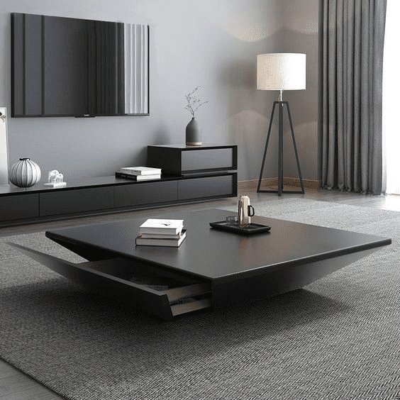
Black
Source: Pinterest
Combining black with white and grey furnishings will give it a rich effect. You can also use a black table as well. If you choose this style, be sure to have a lot of lighting. You may notice that your living space looks drab due to black because black absorbs light. This predicament can be easily escaped, however, with good lighting.
Lime and mauve

Source: Pinterest
This is a dynamic and bold combination that would make an interesting statement in any room. Lime green brings a fresh and vibrant feel, while mauve provides a subtle sophistication and romantic feel.
FAQs
What is the most popular furniture colour?
Due to its general adaptability and appeal, white is the most famous furniture colour for painted furniture due to its ability to create unique hues. It is also frequently used to create two-tone effects.
What is the most suitable colour to complement wooden furniture?
Greys, beige, and greens are obvious choices. Oranges, browns, rusts, and reds can also be effective, although deeper tones are preferred.
Which furniture style do you prefer, light or dark?
A small space can appear larger and more spacious with light furniture rather than dark furniture, which stands out. A substantial amount of light enters the room as a result. Large rooms, however, might not work well with the table in shades since they seem too open.
| Got any questions or point of view on our article? We would love to hear from you. Write to our Editor-in-Chief Jhumur Ghosh at jhumur.ghosh1@housing.com |


