We all strive for our home decor to be a reflection of our personality. And when it comes to free-spirit and whimsy, there’s nothing better than the boho theme to capture it. Eclectic and dynamic, this theme involves mixing and matching colours, textures and elements to achieve a space that is high on visual interest. While boho offers endless creative possibilities, it is essential to pick a starting point for a hassle-free decor experience. In this article, we will explore some colour palettes that are in trend in 2024 that can significantly amp up your boho space.
See also: Boho decor ideas to amp up your living space
Warm earth tones
A perfect balance of comfort and style, this palette creates a serene and grounding ambiance. This is the one you should go for if you appreciate a natural, earthy look and feel.
Terracotta
This rich and earthy hue of orange-red brings warmth and depth to any space. Reminiscent of sun-baked clay, it is preferred for the cosy and inviting environment it creates.
Burnt sienna
A reddish-brown shade with a rustic feel, this colour provides a natural and organic touch. Its ability to complement both lighter and darker hues equally well makes it a popular and versatile choice.
Olive green
A muted, greyish-green can invoke a sense of calm inspired from nature. Its resemblance to natural elements makes it an excellent grounding colour as well as a great complement to other earthy tones.
Sand beige
This soft, neutral beige with warm undertones is just the colour you need to pair with the more vibrant shades in the palette. Being a neutral and versatile shade, it helps maintain balance and prevents the space from becoming too overwhelming.

Source: Pinterest @etsy
Muted jewel tones
For the sophisticated boho lovers, this palette combines richness and subtlety to result in a palette that’s both vibrant and refined.
Emerald green
Add a touch of sophistication and opulence to the space with this luxurious and deep shade of green. Vibrant yet understated, it makes for exceptionally attractive focal points.
Sapphire blue
Oozing depth and elegance, this jewel tone is known for its rich intensity. The versatility of this shade can give it both calming and dramatic feels depending on the usage.
Amethyst purple
Bring home a subtle vintage feel with this soft, mystical shade of purple. The ideal choice if a sense of mystery and relaxation is what you’re looking for.
Golden mustard
Add a pop of brightness and energy to the space with this warm shade of golden yellow. Pairing exceptionally well with other jewel tones, it is preferred for the balanced look it brings.
Source: Pinterest @etsy
Sunset hues
Seeking inspiration from the twilight sky, this palette offers a vibrant and warm vibe that brings a dynamic energy to any room.
Coral pink
This lively and bright pinkish-orange perfectly evokes the warmth of a sunset. Moreover, the hint of energetic playfulness also adds a cheerful touch
Sunset orange
Nothing better than a warm, glowing orange to capture the essence of the setting sun. Alongside warmth, it also adds a sense of vitality to the space that is a significant mood booster.
Golden yellow
Bring home the cheerfulness of this bright, sunny yellow and further enhance the warmth of the space by adding a pop of colour.
Deep plum
Finally, for a hint of drama, there’s nothing better than a dark, rich purple with reddish undertones. It adds depth to the palette and balances the brighter tones.
Neutral and natural
This palette is all about creating a tranquil and sophisticated space with a blend of calming neutrals that work harmoniously together.
Soft ivory
This creamy, off-white provides a clean, fresh backdrop. It’s a versatile option that pairs well with both bold and subtle tones.
Warm taupe
A blend of grey and brown with a warm undertone is the characteristic feature of this colour. The calming, neutral effect adds sophistication to the space and complements a variety of other hues.
Rich charcoal
For a strong contrast to lighter colours, consider this deep, dark shade of grey. It serves the purpose of adding depth and a modern edge to the boho aesthetic.
Dusty rose
Further, add a touch of warmth and romance without being overpowering with this muted, vintage pink. It provides the ideal dash of colour to prevent the neutrals from becoming too monotonous.

Source: Pinterest @etsy
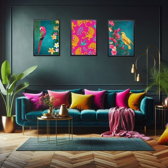
Bohemian blues
Offering a mix of deep and light blues, this palette creates a serene and sophisticated atmosphere that can be further accentuated with the warm glow of copper.
Teal
This vibrant mix of blue and green brings a refreshing and invigorating touch to the space. Go for it if you wish to create a lively and soothing environment.
Navy blue
The classic deep blue is preferred for the elegance and sense of calm it brings. Moreover, it is exceptionally versatile and works well as an anchor for other colours.
Powder blue
The soft, pastel blue evokes tranquillity and lightness to balance the richness of navy blue and teal. It adds a gentle touch to the overall palette.
Copper accent
Complete the look by incorporating a metallic element to the palette that adds warmth and a touch of glamour. Introduce copper accents to the space in the form of decor items like lamps, vases and picture frames.

Source: Pinterest @englishelm
Tropical vibes
This is a playful and vibrant palette ideal for creating a lively, tropical-inspired space with a boho twist.
Aqua green
Nothing better than a bright and refreshing greenish-blue to bring vibrancy and a lively energy to the space. Imitating the freshness of tropical waters, it is perfect for a lively boho feel.
Papaya orange
Bright, tropical orange adds a burst of energy and warmth, characteristic of the boho aesthetic and results in an overall more cheerful and inviting atmosphere.
Banana yellow
Enhance the tropical vibe further with this sunny and cheerful yellow that instantly adds a sense of joy to the room.
Coconut cream
This light and warm off-white admirably balances the bolder tropical colours of the palette and adds a touch of subtlety in an otherwise very vibrant palette.

Source: Pinterest @Ashieluxy
Vintage pastels
By combining soft, nostalgic colours, this palette creates a gentle and charming boho look that is both cosy and elegant.
Mint green
This cool, soft green adds a refreshing and calming touch. Subtle and soothing, it is ideal for creating a relaxed ambiance.
Blush pink
Add a dash of warmth and romance with this gentle, rosy pink. It significantly enhances the softness of the palette and the entire decor scheme.
Lavender
This light, calming purple is known for its ability to enhance the sense of tranquillity and charm and create an overall serene and peaceful environment.
Creamy peach
Top the look off with this soft, peachy beige for a touch of warmth and a vintage feel. Being a versatile neutral, it beautifully complements the other pastels.

Source: Pinterest @etsy
FAQs
What are the key features of a boho colour palette?
A boho colour palette features an eclectic mix of colour inspired by nature, art and vintage influences, such as warm earthy tones, vibrant hues and a mix of neutrals.
How can I incorporate a trendy boho palette without overwhelming the space?
Use trendy colours as accents combined with a dominant neutral base to prevent the space from getting overwhelmed.
Can I mix different boho colour palettes in one room?
Mixing different palettes can result in a dynamic and personalised space as long as the colours are in harmony with the presence of a unifying element.
How to choose the right colours for a small boho space?
For smaller spaces, consider using lighter shades to create an illusion of space and introduce darker or more vibrant colours through decorative accents.
How do I balance bold colours with neutral tones in a boho space?
Use neutral tones as the primary background and introduce bolder colours through accents like furniture, textile and accessories.
What colour combinations should be avoided under boho decor?
While there are no hard-and-fast rules, it is recommended to avoid overly harsh or jarring combinations that clash with each other and overwhelm the space instead of making it more relaxing.
Can I update my boho decor with new colour trends without a complete overhaul?
Incorporate newer colours into your boho decor through changeable items like throw pillows, curtains, rugs or artwork, and by swapping accessories for trendier colours.
| Got any questions or point of view on our article? We would love to hear from you. Write to our Editor-in-Chief Jhumur Ghosh at jhumur.ghosh1@housing.com |